The colors play a very important role to brands, because in addition to making them look showier, also influence the emotions of consumers.
When it comes to branding, colors offer the opportunity to transmit the personality of the brand which makes them get differentiation, attracting only the right niche market. That’s why the visual and textual elements must be selected based on a strategy.
There are many brands that give the wrong message because they don’t really have clear what they want to communicate when they are creating all the visual design.
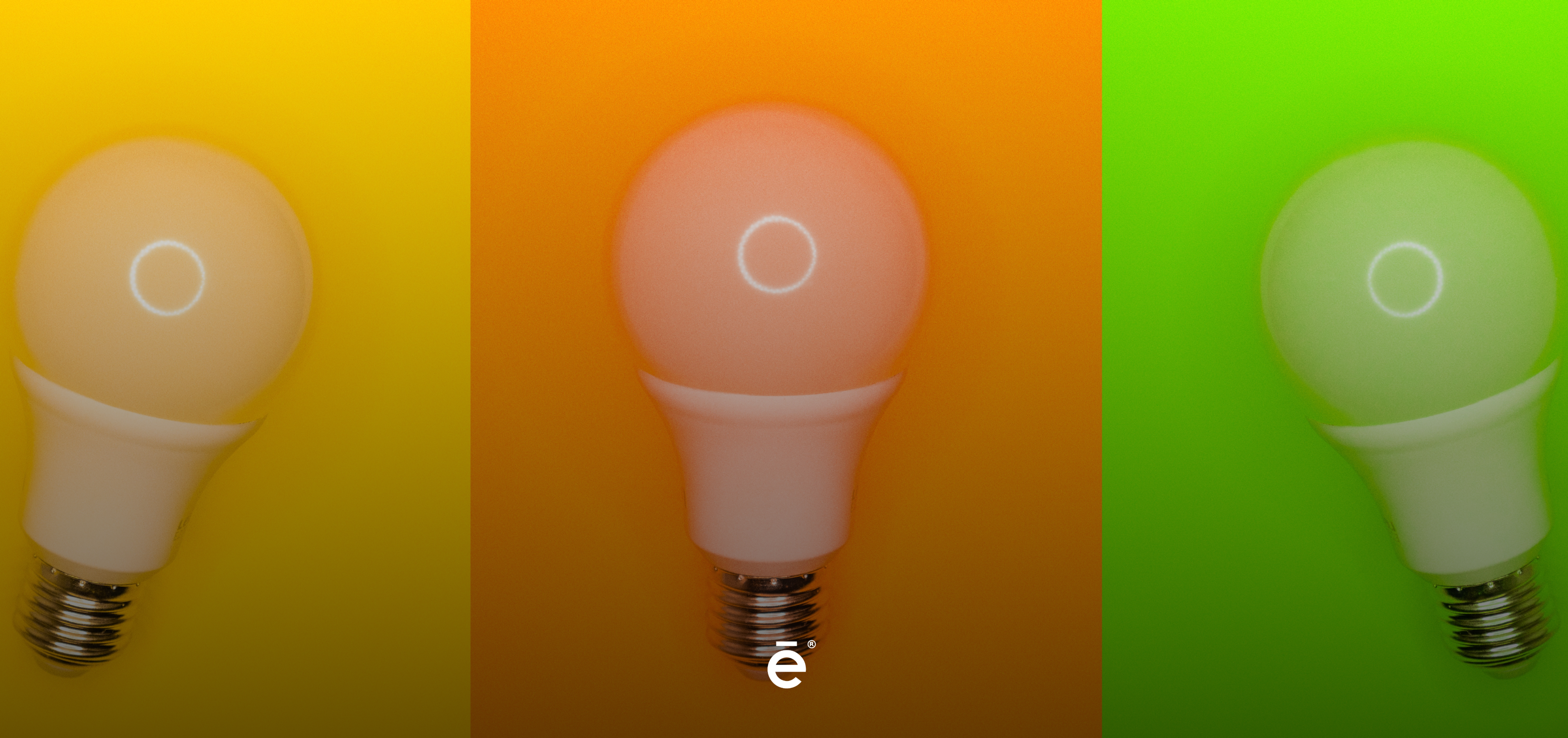
Not having a medium-term plan, not even in the long term, generates time and economic losses. For example, did you know that the color orange increases the appetite and the color blue decreases it?
To have a better idea, we’ll see the meaning of colors and how big brands have known how to use it very well.
-
COCA-COLA: RED
Red is used to transmit that something is strong and provocative, it symbolizes, on an emotional level, passion and intensity.
It also transmits, action, energy and some urgency, that’s why you’ll see it in some highlights of certain promotions. And it has the property of accelerating your heart and of course, open the appetite.
Since ancient times the most famous, soft and refreshing drink around the world began to use the red label. This helped them to get a differentiation from the entire competition.

-
FACEBOOK: BLUE
The opposite of red, this color transmits calm and peace. It’s the most natural color and most seen by humans since it’s the color of the sky and the sea.
Why do you think surgeons and nurses wear blue uniforms? Blue increases confidence, because it’s not aggressive. In addition, dark blue represents masculinity, other shades represent innovation and professionalism.
And as an example, great brands such as Facebook, Twitter, Skype, WordPress, and many others focused on technology use it.

-
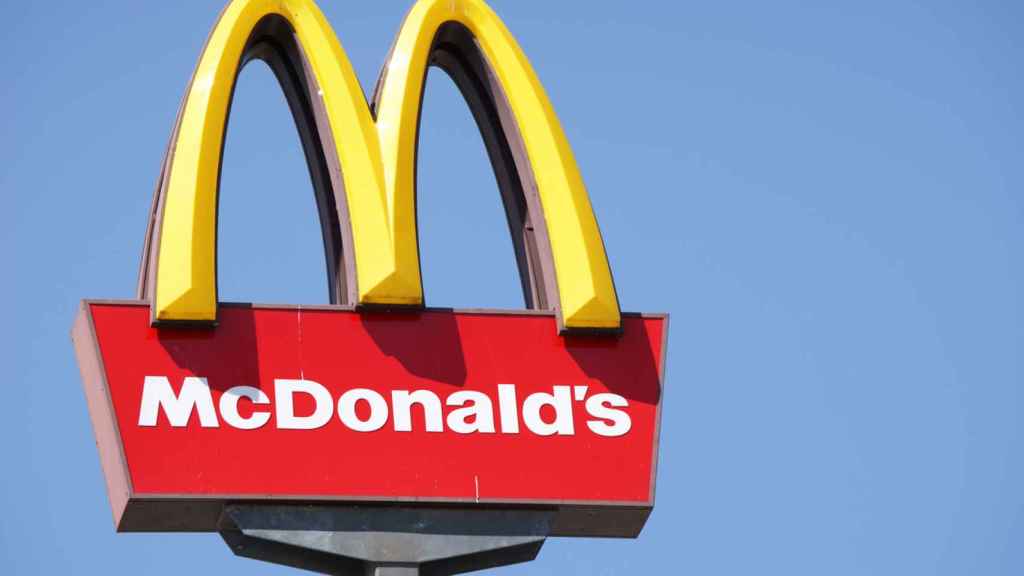
MCDONALDS: YELLOW
Yellow is a happy and young color that transmits positivity and clarity. It promotes communication and stimulates mental processes.
Mcdonalds has perfectly combined the color red with yellow. Why? Because its personality is cheerful, fun and loving.
-
RAPPI: ORANGE
Warm color, which transmits enthusiasm and excitement. An orange logo seems friendly and cheerful. Also, don’t forget: it causes an action on the consumer.
Rappi’s personality always wants to make his clients feel that they have a trusted friend, it’s a jovial brand able to do important tasks for you. For example: Go to the supermarket to do the shopping and take it to your home.

-
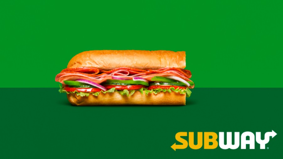
SUBWAY: GREEN
The color of health, calm and the environment. It also symbolizes peace and personal care. By the way, did you know that the human eye distinguishes more shades of green than any other color?
A good example is Subway, it provides healthy food to its customers and its main characteristic is to have fresh vegetables.
-
COSMOPOLITAN: PINK
Pink is the color of femininity, energy without agitation. It transmits fragility, innocence, and kindness. In addition, it’s the color of the dreams worlds and unreal.
The Cosmopolitan magazine has a very simple logo. They are only pink letters and without further complications, it’s very clear that this is focused on women.

Something important to note is that there are many shades of the colors mentioned before and even these can give different messages. Is not the same sensation generated with sky blue color than with dark blue. So now you know a pretty useful secret kept by the big brands.