When you experience knowing or creating a brand, the first thing you do is listen to the name which directly guides you to the logo.
Currently, there are many brands that have known how to position their colors, what differentiates them and what represents them.
A logo is the first factor to recognize a brand, it also affects the perception that the client has about it, without a doubt the logo can become a useful ally for positioning on the client’s mind.
Why is the brand logo so important?
It’s the face of your project and represents your identity and your values, providing essential information to your potential clients. The identity is the element that your customers will remember.
These are some of the features that your logo must have to communicate with your target:
- Simplicity: “Less is more” because it’s a symbol that maybe is going to be seen in very small size and an excess of elements will make it lose its essence.
- It’s unique and original: This is the key to making your logo stand out by itself, don’t be guided by any other and get inspired by the values of your brand.
- Make it attractive to your target audience: Think about their tastes and preferences so since the beginning, you’ll connect with them.
- It should be adapted well to different formats: You’ll never know what you’ll need it for, think about how it can be accommodated anywhere.
- It has to be present in all the elements of the company: It’s your banner, use it, make it present and that makes your team loves it so they can defend it.
- No outdated: The idea is to have a timeless logo that can survive the passage of time, always taking into account that over time it’s probably it will need minor retouches and modernizations.

The brands communicate through the colors.
Discover what your logo communicates analyzing the colors that these can have:
Blue: It mainly transmits security, trust, intelligence, communication. Blue is currently associated with technology and if you go to the negative part it can mean coldness.
Red: It’s the color that attracts more attention, reflects energy, power, strength, and passion.
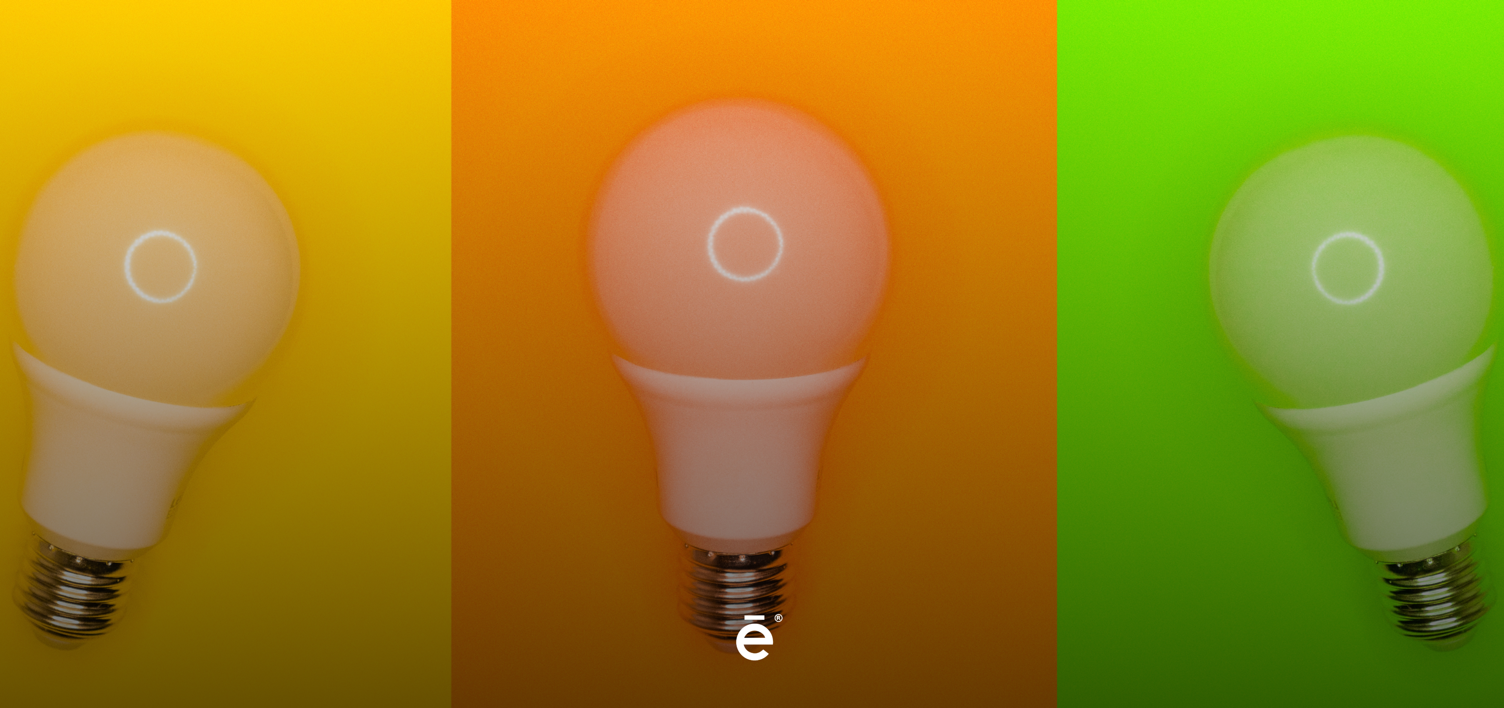
Yellow: The color of joy, optimism, creativity, and innovation. It’s very visible, but in large quantities, it can create anxiety, it is also not always possible to read.
Green: It’s automatically associated with ecology or nature, it’s the most relaxing color for the human eye. It suggests stability and resistance.
Orange: It is also a cheerful and sociable color, associated with the economy and the sun, it fits very well with the young audience.
Black: In general, it usually has a negative meaning, associated with darkness and death. But for advertising, a black logo conveys seriousness, elegance, and authority. It’s a classic color of luxury brands and the favorite of Endor.
Multicolored: They play with more than one color and try to represent the amplitude that presents them.
Do you know what your logo communicates? Now you know what they transmit and the influence they can have on your audience, never leave your logo aside, take care of it and remember that it is your banner.